TSB brand redesign
TSB — Brand redesign
- Branding
- Design
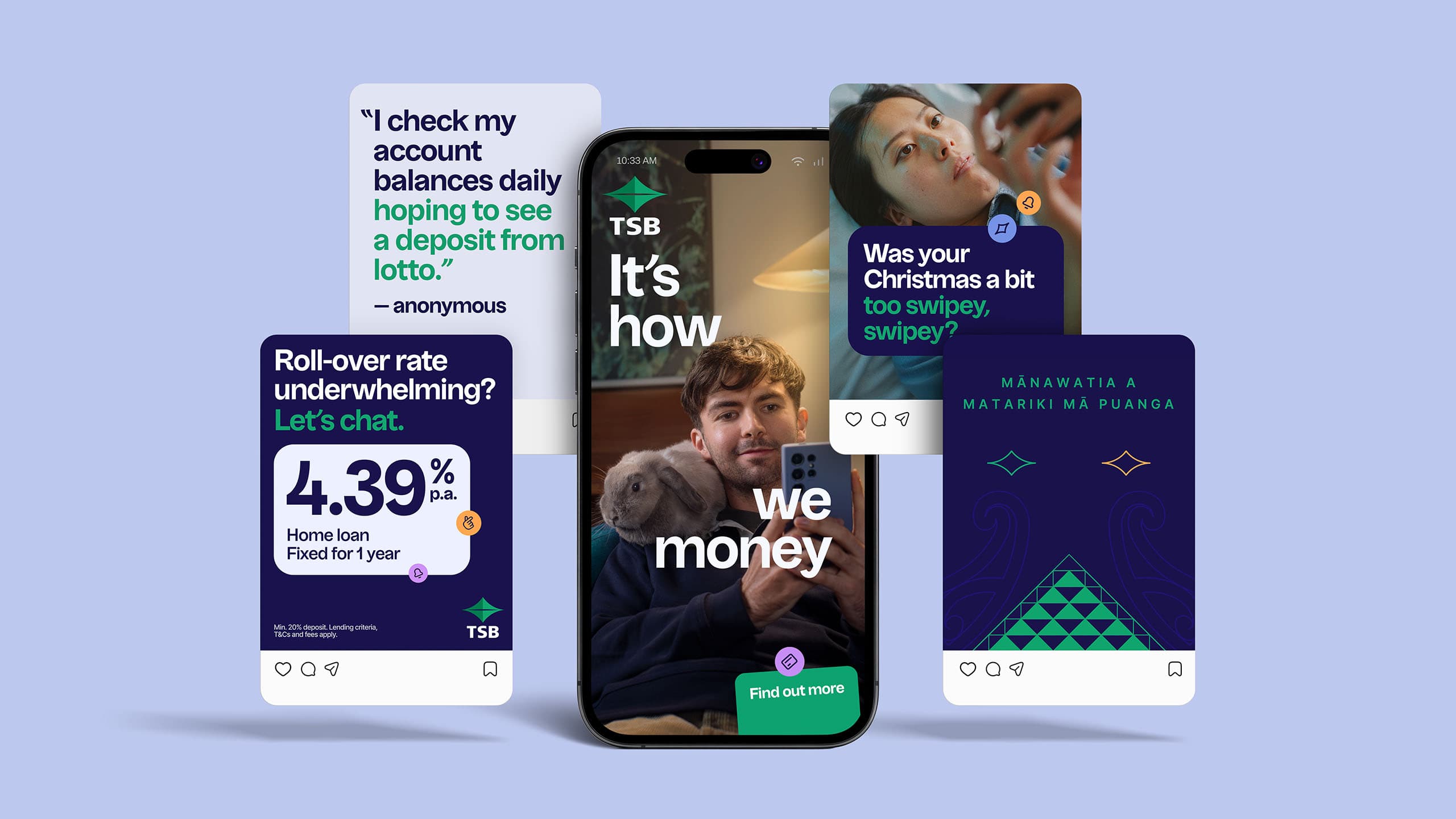
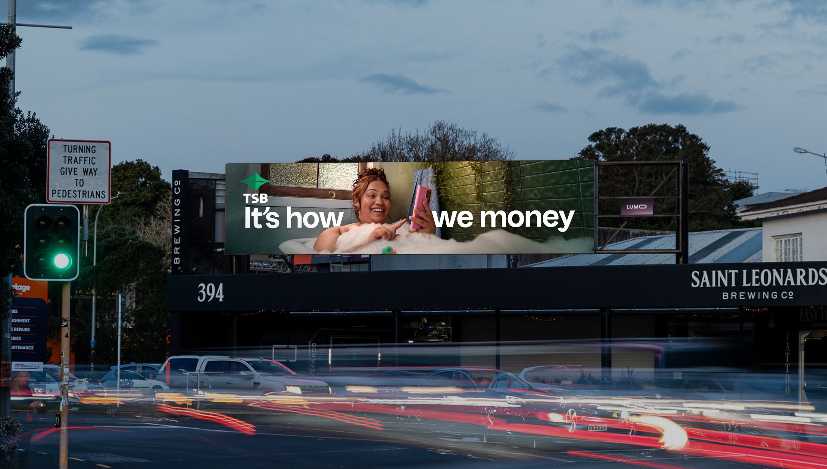
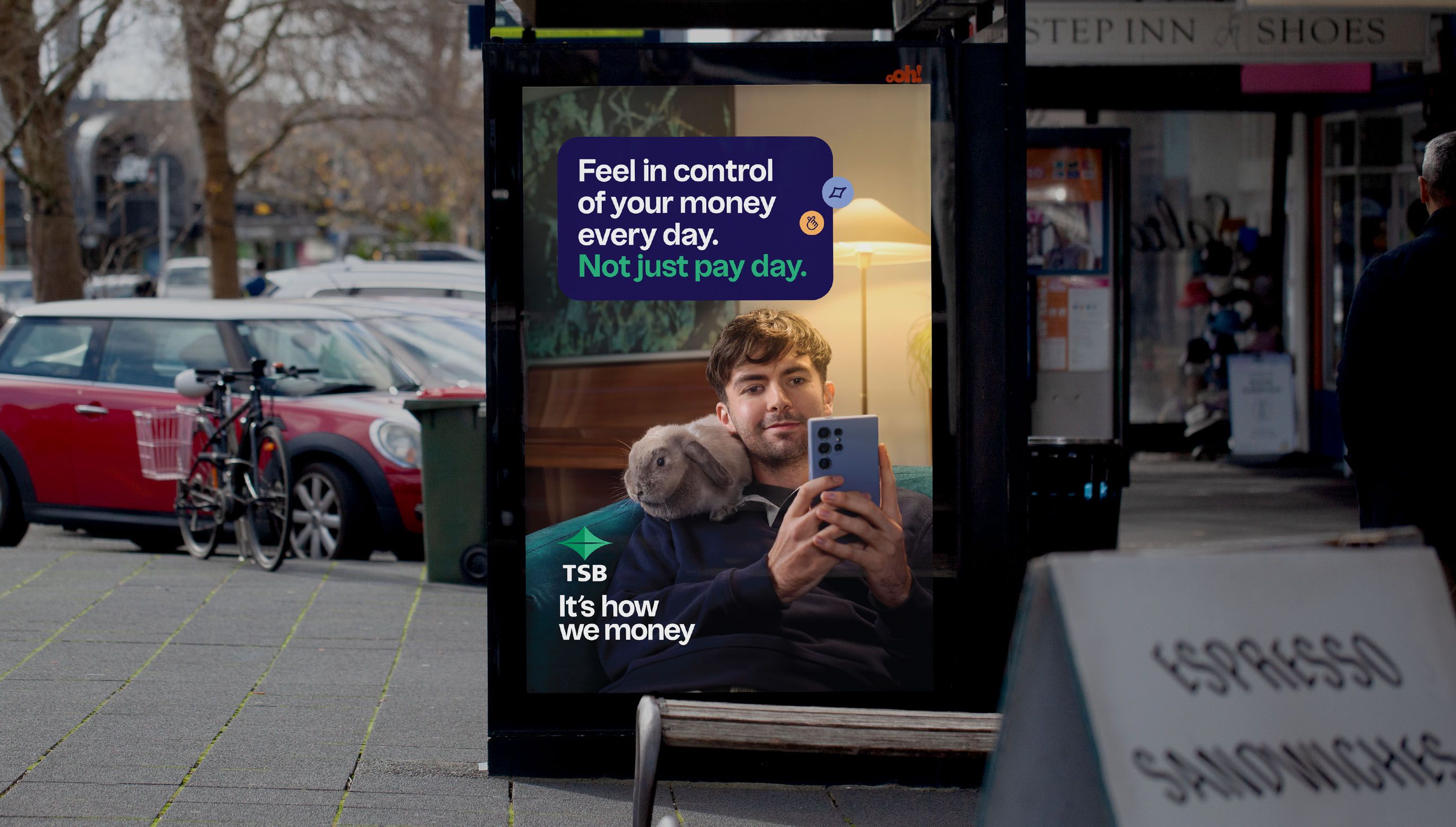
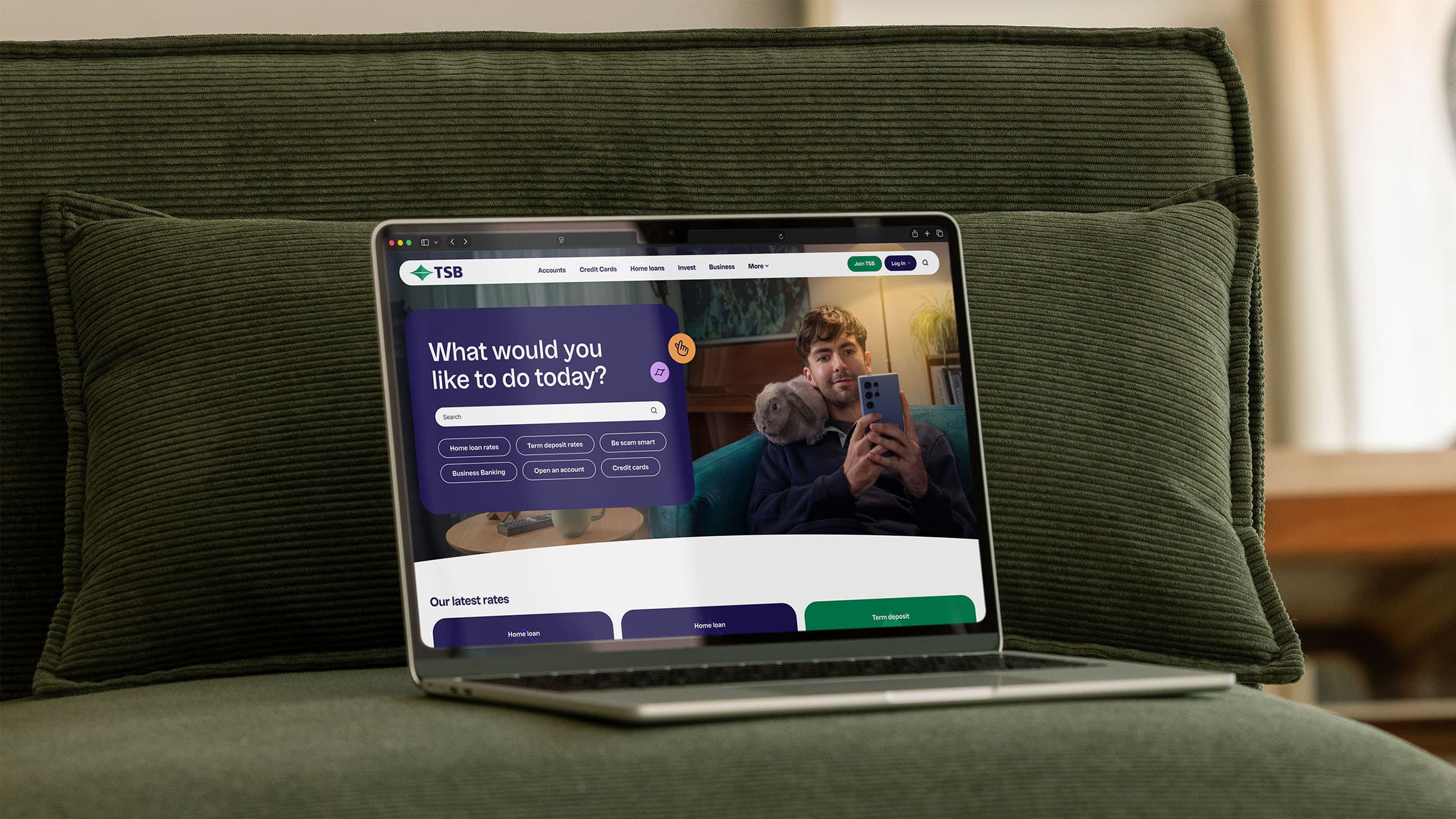
TSB needed a more comprehensive visual expression that reflected a people-first, uncomplicated, and accessible bank. We called the approach “rounded and grounded”: accessible, human and softer-edged. Playful, staying true to the brand colours and feel but with new, earthier secondary tones.
Developed in partnership with YS and cultural consultancy Ira, the design approach leans into the core tenets of the bank - warmth, humanity, community and progress.
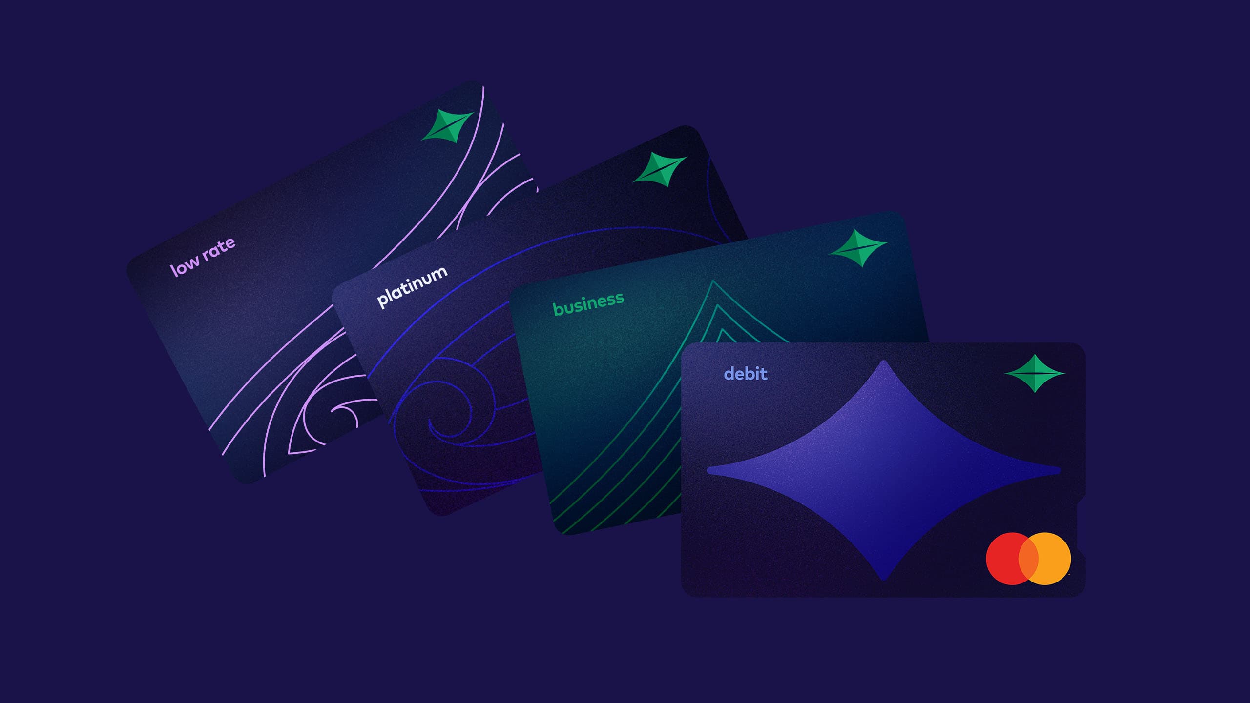
The logo shape - Mt Taranaki reflected in the nearby Pouakai Tarns - is a distinctive asset that was brought to new life, freeing it to move, grow and interact with the world around it. Sometimes it becomes the hero. Other times, it creates texture and energy in the background.
Cultural narratives played a key role, leaning into the bank's Taranaki origins. The use of elements in Māori art such as pūhoro, mangopare and poutama are used deliberately and meaningfully, to represent the dynamic energy of Taranaki's emergence, pathways of life and prosperity, and the constant pursuit of growth, knowledge and improvement.
Watch Now
TSB Brand redesign